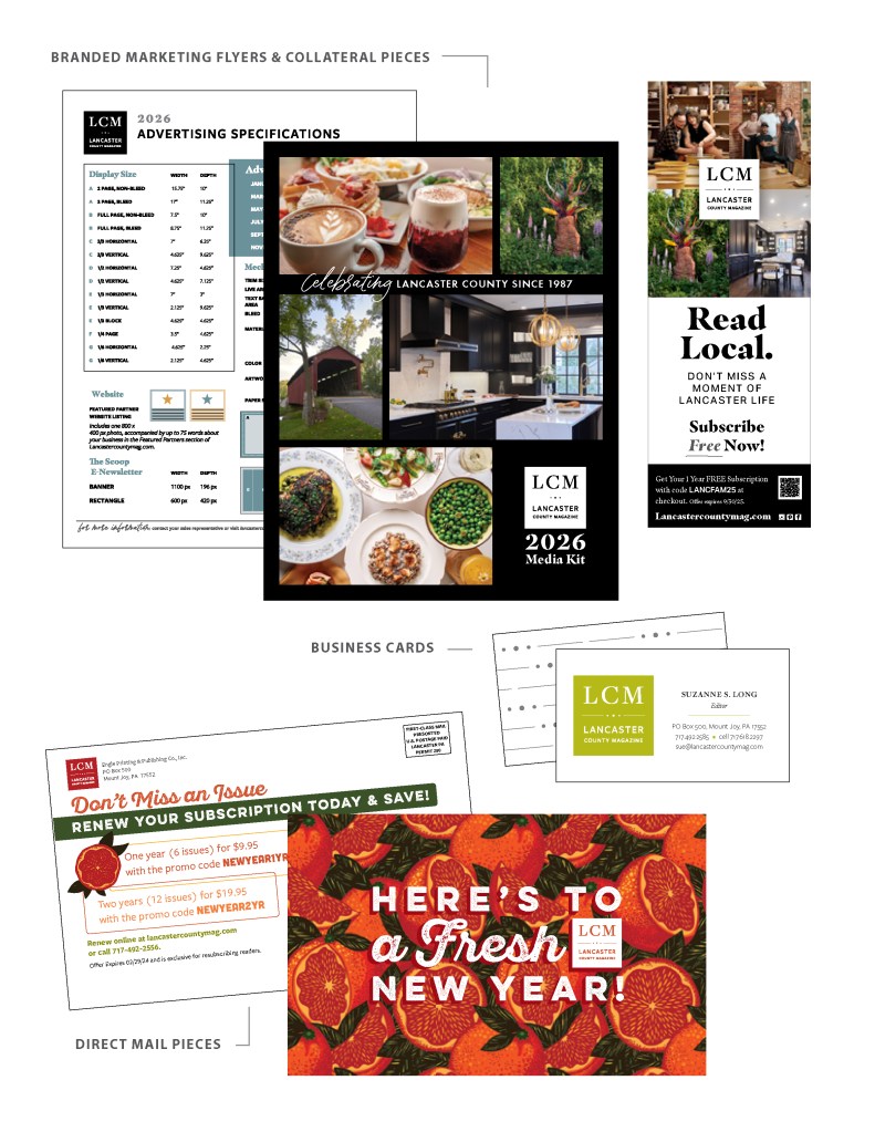
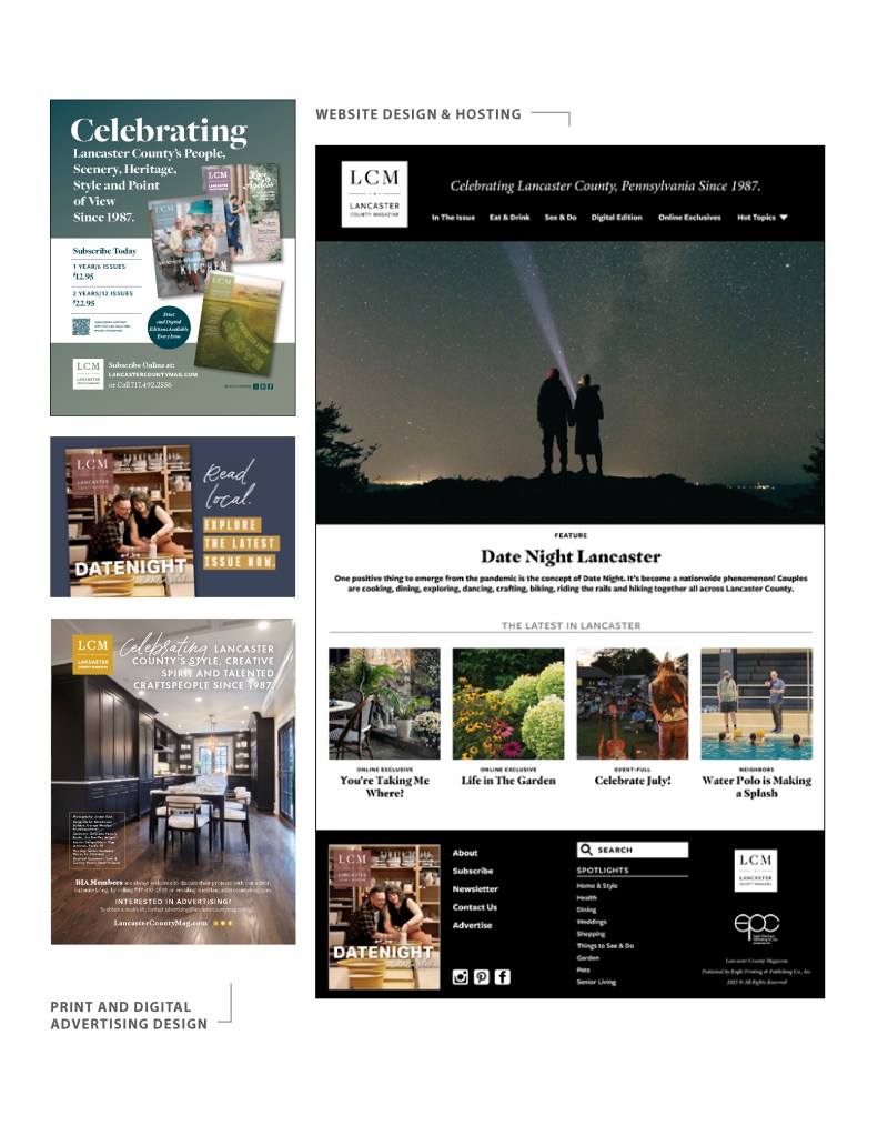
Lancaster County Magazine
I led and developed the rebranding and new logo design for Lancaster County Magazine in 2018 and maintained its evolution since. The logo itself is meant to be a classic and timeless mark and the branding look and feel is able to shift and adapt to the content covered, while maintaining the magazine’s authentic voice. The collateral pieces shown here include direct mail postcards, business cards, print and digital advertising and web designs. In 2025 I redesigned the look of our digital presence, working with the publisher’s back-end developer to implement the new interface.

Branding/logo design and business card for photographer Jordan Bush. This piece took inspiration from manual camera mechanisms, vintage cars and the stories about people and food that Jordan specializes in photographing and writing about.
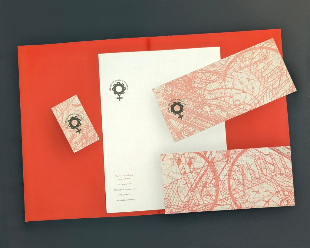
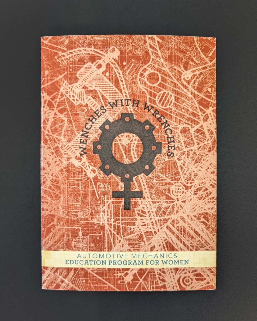
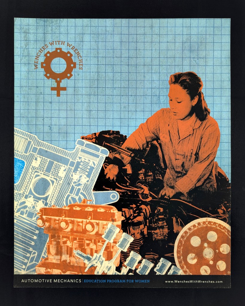
Wenches with Wrenches
This project includes identity, branding, logo design, course catalog and poster designs for my concept of an inclusive trade school that specializes in educating women in industries that are traditionally male-dominated. The logo design combines a mechanical typeface with the female symbol that includes a mechanical gear. The branding included striking colors, photo illustrations and collage work pulling from blue prints and schematic drawings, instruction manuals as well incorporating vintage photos of feminine workers a la Rosie the Riveter. (student work, completed at Tyler School of Art)
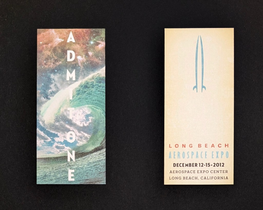
Long Beach Aerospace Expo Logo, Branding, Collateral
The logo design for this conference utilizes two surfboards to create the image of a spaceship to reference both the location (a popular surfing destination) as well as the space travel content of the expo. Imagery used for the branding included my digital photo illustrations that combined vivid imagery of surf and space. (student work, completed at Tyler School of Art)
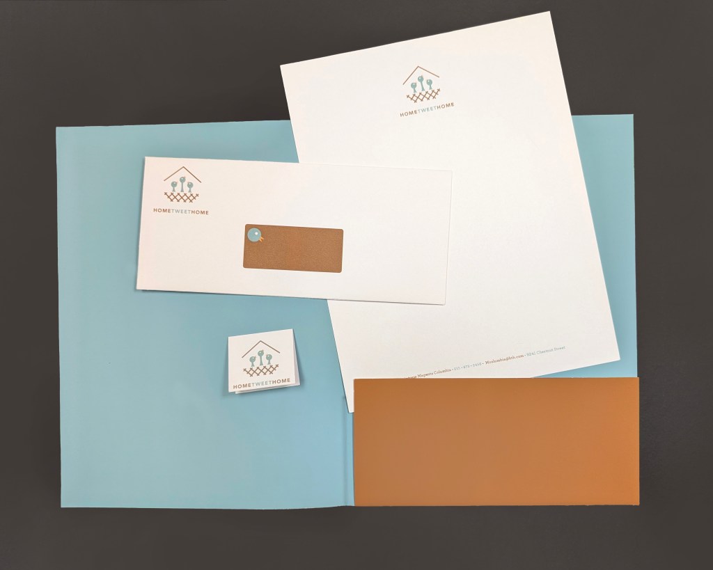
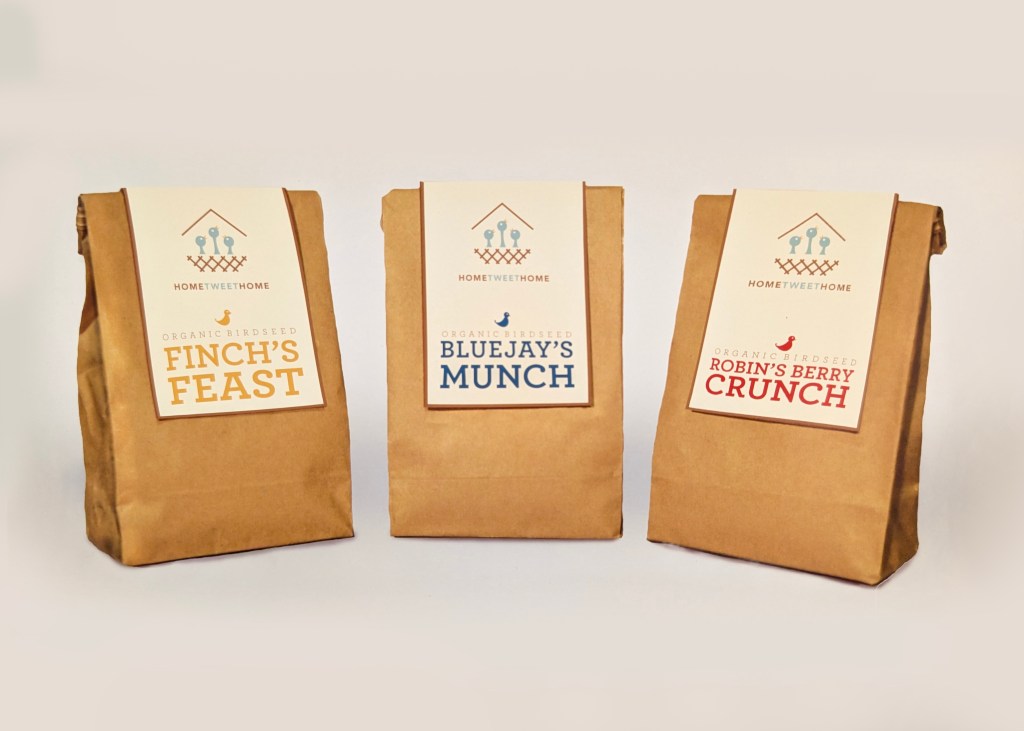
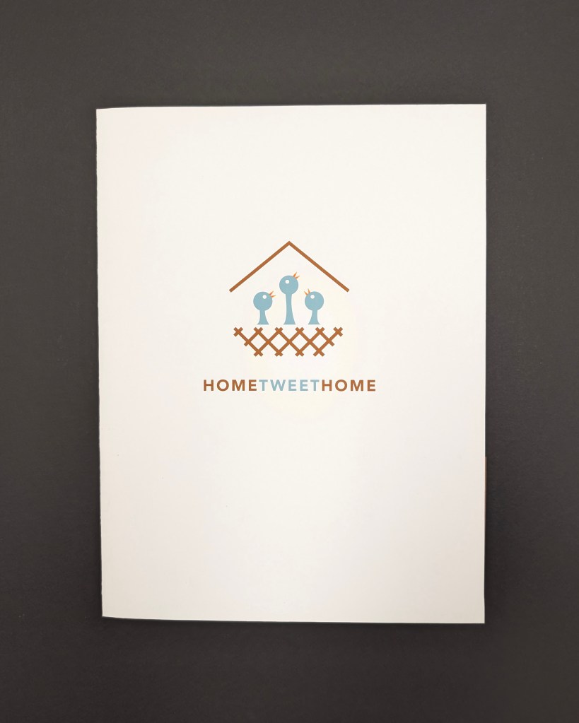
Home Tweet Home Logo, Branding and Packaging
The designs for this project focused on an organic, warm and almost minimalist aesthetic, giving the vector illustration and typography choices the ability to convey the brand’s offerings of high-end, species-specific bird seed and housing for ornithology enthusiasts and hobby birders. (student work, completed at Tyler School of Art)